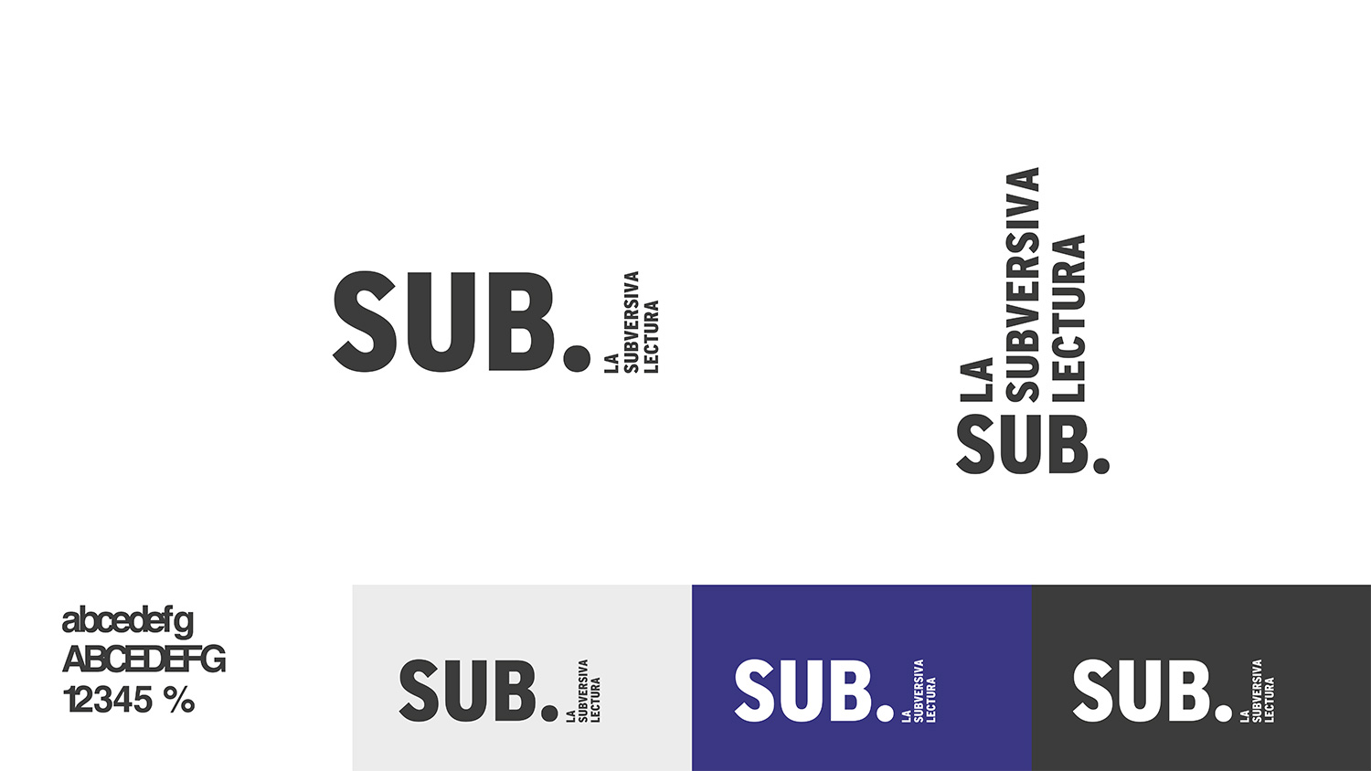
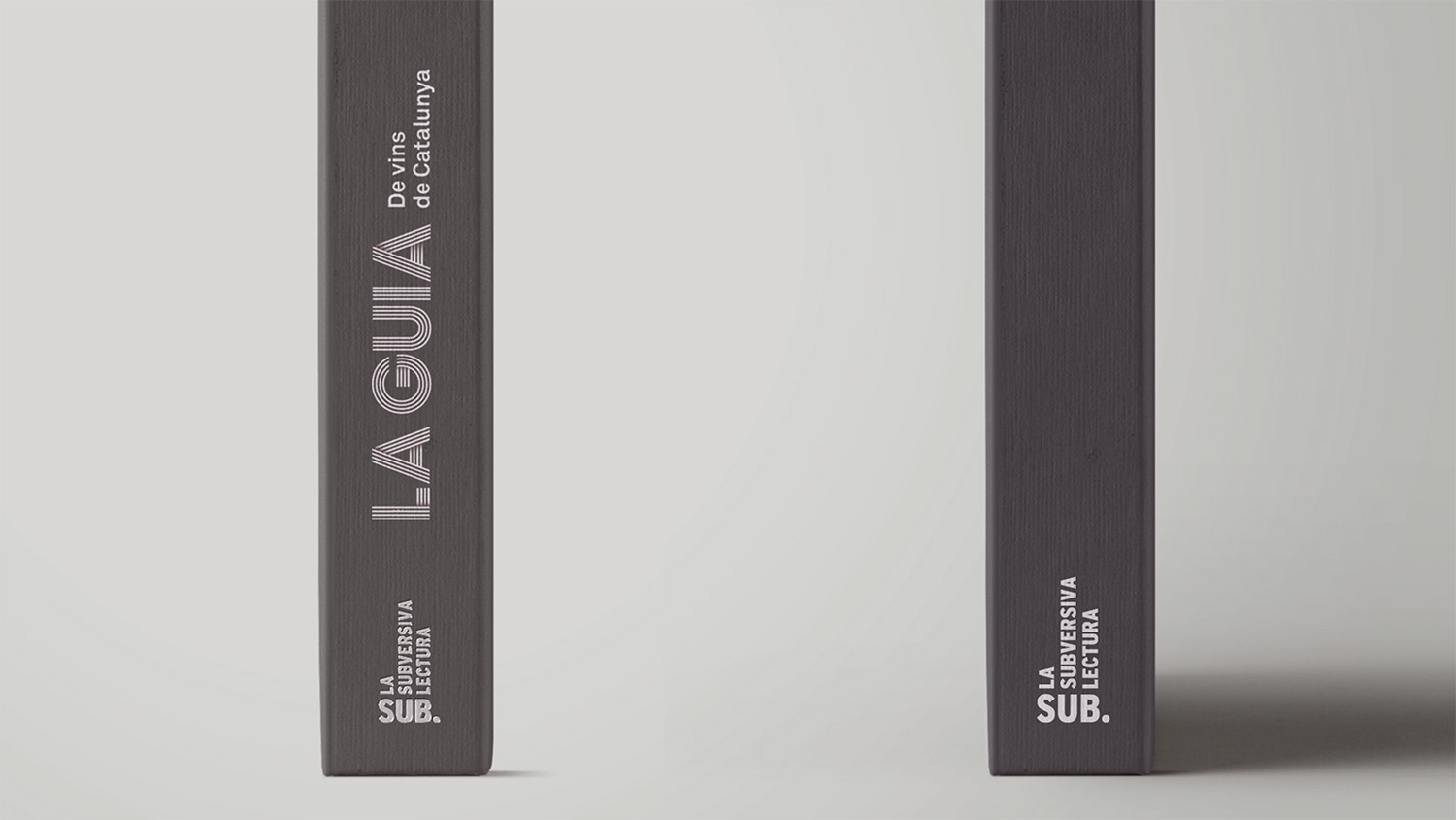
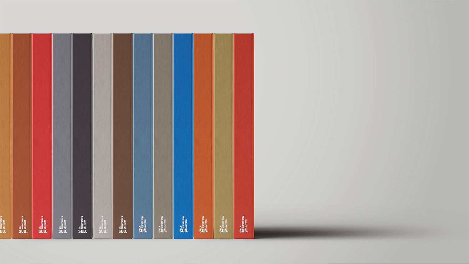
They were looking for an identity to harvest the fruits of more than a decade of work and open new boundaries in the publishing world. With a robust and provocative naming, La Subversiva Lectura (“The Subersive Read”) led us to a sober and forceful graphic identity. Solid colour, straightforward typography with no bustle and acomposition referred to a bookcase full of books now characterizes the brand —reading and subversion they go so many times by the hand.